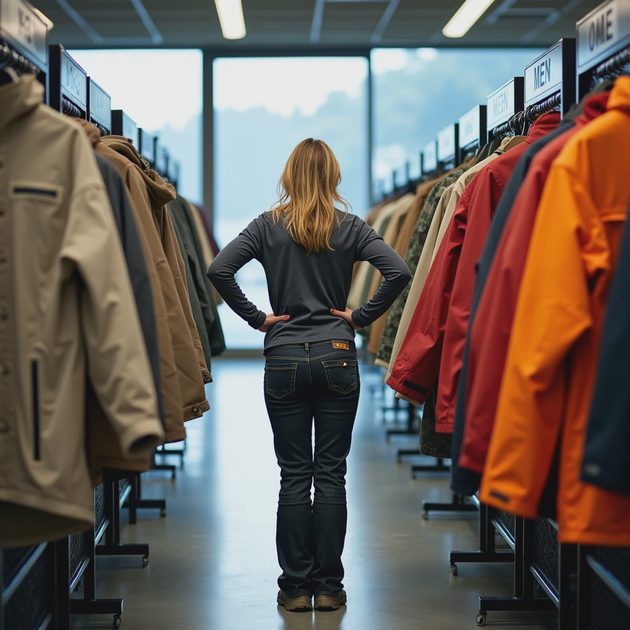
I walked into an REI last month with one goal: find a women's rain jacket that wasn't beige. Not "sand." Not "dune." Not "oyster." Not whatever Pantone name they hired a consultant to invent. Just any color that would make me visible against a granite slab in a drizzle.
I found exactly two. One was a shade of purple so aggressive it looked like a bruise. The other was neon coral that screamed "I gave up and just grabbed the clearance rack." Everything else on the women's wall was some variation of beige, tan, sage, or "mineral gray." The men's side had a few more options — mostly navy, forest green, and the exact same gradient of earth tones, plus one bright orange shell that felt like a prank.
I stood in that aisle for ten minutes, genuinely confused. We ask outdoor gear to do a lot of things — keep us dry, keep us warm, keep us alive. So why are we dressing ourselves to blend into the very landscape we're trying not to get lost in?
The Beige-ification of Outdoor Gear: A Timeline
This didn't happen by accident.
Rewind to 2005. Outdoor gear had two color palettes, and nobody was confused about either. You had "I'm a serious mountaineer" colors — black, navy, dark green, gray. And you had "I'm having fun and I want to be seen" colors — bright reds, electric blues, safety orange, highlighter yellow. The first group dressed for stoicism. The second group dressed for visibility, and also for personality. Both made sense.
Then streetwear discovered outdoor gear. Arc'teryx, Patagonia, and The North Face crossed over into fashion around 2015-2018. Suddenly the person buying a $700 shell wasn't necessarily a mountaineer — they were someone who wanted to look like they might summit something on the way to brunch. The palette shifted accordingly. Muted tones read as "sophisticated" on a city street. Bright colors read as "tourist." The industry began chasing a customer who wanted to look like they spent time outside, not someone who actually did.
At the same time, brands like Cotopaxi and REI's in-house line started pushing the "Earth First" aesthetic — recycled fabrics in "natural" tones, minimal dye processes, eco-conscious messaging. This was genuinely well-intentioned. Undyed fabrics reduce water and chemical use. But the marketing positioned beige and sage as ethical — and once something becomes a virtue signal in the outdoor community, it's everywhere within two seasons.
Fast forward to 2026, and the industry has landed in a strange place: the most expensive outdoor gear on the market now comes primarily in colors designed to make you invisible against rocks, trees, and fog. We've aestheticized ourselves into camouflage — and not the functional kind.
Why This Is Actually a Problem
If you're buying a down puffy to wear to the farmers' market, beige is fine. Beige is great. Beige goes with your jeans, your sneakers, your oat milk latte. I have beige gear. I like beige gear.
But the outdoor industry isn't selling exclusively to brunch crowds. They're still selling to people who hike above treeline, who climb in variable weather, who paddle in coastal fog, who ski in whiteout conditions. And for those people, color isn't a style choice. It's a functional feature.
Visibility is a safety feature. If you fall on a snowfield in a white jacket, your partner has to squint to find you. If you're searching for your tent at dusk in a forest of brown and green, that sage-colored fly blends in perfectly. If you're skiing in low light and wearing "mineral gray," you've made yourself harder to see — and harder to rescue if something goes wrong.
This isn't hypothetical. Search and rescue teams have been vocal about this for years. Brightly colored clothing and gear make people easier to spot from helicopters, drones, and ridgelines. A 2023 survey of SAR volunteers in Colorado found that 78% said brightly colored outerwear would make their jobs measurably easier. Yet the gear industry is moving in the opposite direction.
Identification in a group. On a group trip, everyone's tent looks the same. Everyone's pack cover looks the same. Everyone's shell hanging in the vestibule looks the same. When nine people own a "sand"-colored tent and you're fumbling for yours in the dark, you'll wish someone bought the orange one.
Sun safety. This one is counterintuitive. Lighter colors reflect heat. Dark colors absorb it. But that doesn't mean beige is cooling — it means bright white, light yellow, and specific reflective colors keep you cooler in direct sun. A 2021 study on fabric heat absorption found that bright white kept the body 5-7°F cooler than beige or tan during prolonged sun exposure. The "desert expedition beige" aesthetic is popular, but the science says it's not the best choice for actual desert conditions.
The Women's Color Tax

There's one more layer to this, and it's specifically about the women's gear aisle — or as I call it, "the pastel ghetto."
Women's outdoor clothing consistently comes in a narrower range of colors than men's, and those colors skew lighter, softer, and more muted. Men get "navy," "black," and "forest." Women get "taupe," "mauve," "sea glass," and "blush." I have stood in front of both racks at REI and verified this pattern across five different brands in one afternoon. The only reliably bright color in women's gear is teal, because the industry seems to believe women outdoors want to look like mermaids.
This isn't just patronizing — it's a functional disadvantage. A woman wearing "sea glass" on a rock face is a woman in camouflage. Women mountaineers, backcountry skiers, and trail runners deserve the same visibility options as men. We're not hiking in perfume commercials. We're hiking on actual mountains.
The irony is that brands know this. When I've talked to product designers off the record, they admit the color palette is driven by retail buyers, not by actual outdoor users. Big retailers look at color trend forecasts designed for fashion — Milan, not Mont Blanc — and place their orders accordingly. The person deciding the color of next season's hardshell has never spent a night above treeline.
The Brands Doing It Right (And a Few Misses)
Doing it well:
Cotopaxi — Say what you want about their marketing, but their Del Día line uses remnant fabrics and produces genuinely colorful, one-of-a-kind pieces. Every jacket is different. You will not blend into anything. You will look like a piñata, and you will be visible for three miles.
Arc'teryx — For all their "stealth wealth" black shells aimed at city wearers, their alpine-specific lines (Alpha, Rush) still come in bright reds, oranges, and "Dynasty" — a neon yellow that reads as "I actually ski." They've bifurcated their palette: muted for lifestyle, bright for alpine. It's a compromise, but at least the alpine gear isn't beige.
Fjällräven — Yes, most of their stuff is earth tones. But they consistently offer at least one bright color per product line — Dandelion yellow, bright red, a deep royal blue. You can buy the beige Greenland jacket and still choose the blue one if you want to.
Outdoor Research — Their women's line routinely includes bright reds, oranges, and actual high-visibility colorways. Their Ferrosi hoodie is available in "Paprika," which is exactly the color of the spice and visible from low orbit.
Needs improvement:
REI Co-op brand — The in-house line has crept almost entirely into "nature tones." I want to support REI. I love REI. But when I can't find a single bright shell in their women's lineup, I question whether the co-op has forgotten that its members actually go outside.
Houdini — Beautifully made, deeply committed to sustainability, and every single piece is some shade of gray, blue-gray, or green-gray. I'm convinced their design team works exclusively under overcast Scandinavian skies and has never seen direct sunlight.
The North Face — They have the capacity to make color. They've proven it in their Summit Series line. But their core hiking and lifestyle lines have surrendered to the beige-industrial complex. Finding a bright shell in the women's section requires persistence and possibly a map.
What You Can Do About It (Because Complaining Without Action Is Just Noise)
Buy bright gear when you find it.
Brands make what sells. If the bright colors consistently sell out and the beige ones hit clearance, buyers notice. Every purchase of a "Paprika" Ferrosi instead of a "Sage" one sends a signal.
Email brands.
I'm serious. Customer feedback emails actually get read, especially when they're specific. Write: "I want to buy your Beta LT shell, but I need a bright color for visibility above treeline. The only current option is black. Please add a red or orange option next season." Copy-paste. Send to five brands. It takes ten minutes.
Buy used bright gear.
Some of the best colorful shells I own are from eBay and GearTrade, from the era before beige took over. Patagonia's 2015 colorways, old Mountain Hardwear neon pieces, 2012-era The North Face in actual red. Older gear is often brighter, cheaper, and perfectly functional.
Demand visibility as a feature, not a preference.
When you read reviews, when you post in forums, when you talk to fellow hikers — talk about color as a safety feature, not a style opinion. "I like red" is subjective. "I need my shell to be visible in a whiteout" is objective. Frame it that way.
The Bottom Line
I don't think the outdoor industry is conspiring to make us invisible. I think it's drifting — pushed by fashion crossover, pulled by eco-marketing, steered by retail buyers who don't sleep in the backcountry. The result is racks full of beige, sage, and "mineral gray" gear that blends into the landscape while hikers, skiers, and climbers get harder to see.
Color in outdoor gear isn't frivolous. It's functional. It's safety. It's self-expression in an activity where your gear choices literally keep you alive. The industry needs to remember that its core customer isn't standing outside a coffee shop — they're standing on a ridgeline, looking for their tent in the dark.
Bring back bright. Bring back red. Bring back anything other than beige.
Gear up. Get out. Wear something they can see.
No comments yet — be the first to share a thought.